- Discordクローン作成 1. 環境構築〜Clerkの設定
- Discordクローン作成 2. ダークモード〜Prisma, PlanetScale
- Discordクローン作成 3. モーダルUI, 画像(uploadthing) 👈ココ
- Discordクローン作成 4. サーバ作成, ナビゲーション
- Discordクローン作成 5. サーバー作成用モーダル、サイドバー作成
- Discordクローン作成 7. メンバーの管理
- Discordクローン作成 8. チャンネル作成、サーバ削除・退出
- Discordクローン作成 9. サーバ検索、チャンネルリスト
- Discordクローン作成 10. チャンネルページ作成
- Discordクローン作成 11. 会話ページ作成
- Discordクローン作成 12. メッセージ送信
- Discordクローン作成 13. リアルタイムチャット
6. モーダルUI
モーダル実装を行う
Dialogの追加
モーダルはShadcn/UIのDialogを使用して実装する。 Input、Formも必要となるので合わせて追加する。
pnpm dlx shadcn-ui@latest add dialog

pnpm dlx shadcn-ui@latest add input

pnpm dlx shadcn-ui@latest add form
ダイアログのコンポーネントを作成
セットアップページで利用すべきサーバがない場合、初期化のモーダルを表示する。
import InitialModal from "@/components/modals/initial-modal";

const SetupPage = async () => {

  /* 中略 */

  return <InitialModal />;
};
components/modals/initial-modal.tsx を作成する。クライアント側で利用するため、"use client"; を記述する。
"use client";

import {
  Dialog,
  DialogContent,
  DialogDescription,
  DialogFooter,
  DialogHeader,
  DialogTitle,
} from "@/components/ui/dialog";

const InitialModal = () => {
  return (
    <Dialog open>
      <DialogContent className="bg-white text-black p-0 overflow-hidden">
        <DialogHeader className="pt-8 px-6">
          <DialogTitle className="text-2xl text-center font-bold">
            サーバー設定のカスタマイズ
          </DialogTitle>
          <DialogDescription className="text-center text-zinc-500">
            サーバー名とイメージ画像を選択します。これらは後で変更できます。
          </DialogDescription>
        </DialogHeader>
      </DialogContent>
    </Dialog>
  );
};

export default InitialModal;
<Dialog>はopenプロパティで表示非表示を切り替えることができる(初期状態 trueとする)- 構造は公式ドキュメントのDialogを参考にする
フォームの追加
shadcn/uiのFormはreact-hook-formとzodを使用しているので、追加した際に一緒に入っている。
どちらもよく使われるパッケージなので、ある程度使いこなせるとできることが増えるはず。
zodResolver を使うことでreact-fook-formとzodを連携させることができる。
import * as z from "zod";
import { zodResolver } from "@hookform/resolvers/zod";
import { useForm } from "react-hook-form";

const formSchema = z.object({
  name: z.string().min(1, {
    message: "サーバー名を入力してください",
  }),
  imageUrl: z.string().min(1, {
    message: "サーバーイメージのURLを入力してください",
  }),
});
ローダーの追加
useFormで作成したオブジェクトは、formStateという状態を保持しています。送信状態によってローダーを表示するように実装します。

isSubmittedは フォームが送信されたあとtrueになります。isSubmittingは フォームが送信される間trueになります。isSubmitSuccessfulは フォームが成功した後trueになります。
  const isLoading = form.formState.isSubmitting;

  const onSubmit = async (values: z.infer<typeof formSchema>) => {
    console.log(values);
  };
Form, Button 追加
import {
  Form,
  FormControl,
  FormField,
  FormItem,
  FormLabel,
  FormMessage,
} from "@/components/ui/form";

import { Input } from "@/components/ui/input";
import { Button } from "@/components/ui/button";
DialogContentにFormを実装する
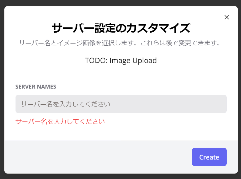
    <Dialog open>
      <DialogContent className="bg-white text-black p-0 overflow-hidden">
        <DialogHeader className="pt-8 px-6">
          <DialogTitle className="text-2xl text-center font-bold">
            サーバー設定のカスタマイズ
          </DialogTitle>
          <DialogDescription className="text-center text-zinc-500">
            サーバー名とイメージ画像を選択します。これらは後で変更できます。
          </DialogDescription>
        </DialogHeader>
        <Form {...form}>
          <form onSubmit={form.handleSubmit(onSubmit)} className="space-y-8">
            <div className="space-y-8 px-6">
              <div className="flex items-center justify-center text-center">
                TODO: Image Upload
              </div>
              <FormField
                control={form.control}
                name="name"
                render={({ field }) => (
                  <FormItem>
                    <FormLabel className="uppercase text-xs font-bold text-zinc-500 dark:text-secondary/70">
                      Server Names
                    </FormLabel>
                    <FormControl>
                      <Input
                        disabled={isLoading}
                        className="bg-zinc-300/50 border-0 focus-visible:ring-0 text-black focus-visible:ring-offset-0"
                        placeholder="サーバー名を入力してください"
                        {...field}
                      />
                    </FormControl>
                    <FormMessage />
                  </FormItem>
                )}
              />
            </div>
            <DialogFooter className="bg-gray-100 px-6 py-4">
              <Button variant="primary" disabled={isLoading}>Create</Button>
            </DialogFooter>
          </form>
        </Form>
      </DialogContent>
    </Dialog>
ボタンコンポーネントにvariantを追加
variantにprimaryを追加する
primary: "bg-indigo-500 text-white hover:bg-indigo-500/90",primaryカラーのボタンを適用する。
ハイドレーションエラーの回避
現時点ではモーダル表示でハイドレーションエラーが発生する。 これはNext.jsではよく起こるエラーで、回避策としてマウントされるまで待つという方法を使う。
なお useEffectはStrictModeでは2度実行される。これが原因でたまにバグるので注意が必要(冪等性)。
export const InitialModal = () => {
  const [isMounted, setIsMounted] = useState(false);

  useEffect(() => {
    setIsMounted(true);
  }, []);

  const form = useForm({
    resolver: zodResolver(formSchema),
    defaultValues: {
      name: "",
      imageUrl: "",
    },
  });

  const isLoading = form.formState.isSubmitting;

  const onSubmit = async (values: z.infer<typeof formSchema>) => {
    console.log(values);
  };

  if (!isMounted) return null;
7. イメージアップロード用コンポーネントを作成
ここではNext.js向け?の uploadthing を利用する。 Freeプランは2GBまでは無料で使える。

uploadthingの設定
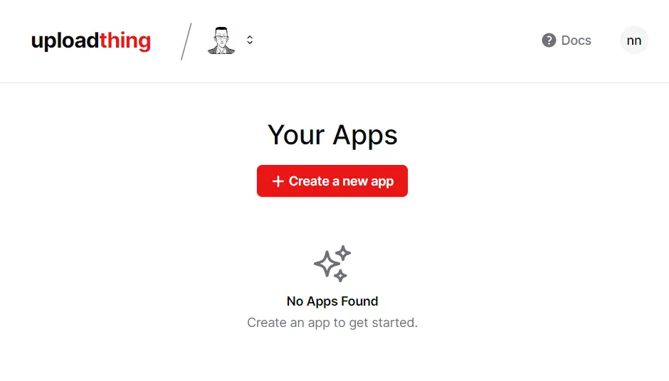
ログイン
現状Githubのみ対応している。ログイン後の画面。
appを作成する
Create a new app から新しいアプリを作成。
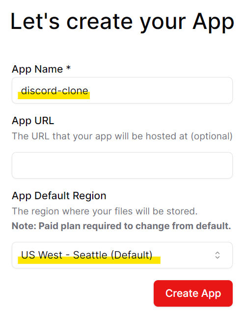
- App Name: discord-clone
- App URL: なし
- App Default Region: US West - Seattle (Default)
アジアリージョンがあるがデフォルト以外は有料プランらしいのでこのままとする。
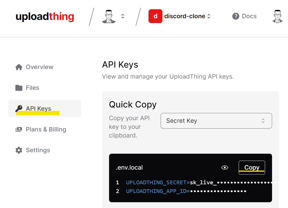
API Keyを取得
API Keysからコピーできるので、こちらを .env にコピーする。
(Next.js特化らしい)
NEXT_PUBLIC_CLERK_PUBLISHABLE_KEY=pk_test_
CLERK_SECRET_KEY=sk_test_

NEXT_PUBLIC_CLERK_SIGN_IN_URL=/sign-in
NEXT_PUBLIC_CLERK_SIGN_UP_URL=/sign-up
NEXT_PUBLIC_CLERK_AFTER_SIGN_IN_URL=/
NEXT_PUBLIC_CLERK_AFTER_SIGN_UP_URL=/

# This was inserted by `prisma init`:
# Environment variables declared in this file are automatically made available to Prisma.
# See the documentation for more detail: https://pris.ly/d/prisma-schema#accessing-environment-variables-from-the-schema

# Prisma supports the native connection string format for PostgreSQL, MySQL, SQLite, SQL Server, MongoDB and CockroachDB.
# See the documentation for all the connection string options: https://pris.ly/d/connection-strings

DATABASE_URL='mysql://'

UPLOADTHING_SECRET=sk_live_
UPLOADTHING_APP_ID=
パッケージの追加
Getting Startedのページにある通りにパッケージを追加する。
pnpm add uploadthing @uploadthing/reactまた、アップロードではドラッグ&ドロップに対応するため react-dropzone も追加する(※公式手順から無くなっているので不要になったのかもしれない
)
pnpm add react-dropzoneuploadthingのコンポーネントを作成
coreコンポーネント作成
手順に従い以下を作成する
import { createUploadthing, type FileRouter } from "uploadthing/next";
import { UploadThingError } from "uploadthing/server";

const f = createUploadthing();

const auth = (req: Request) => ({ id: "fakeId" }); // Fake auth function

// FileRouter for your app, can contain multiple FileRoutes
export const ourFileRouter = {
  // Define as many FileRoutes as you like, each with a unique routeSlug
  imageUploader: f({ image: { maxFileSize: "4MB" } })
    // Set permissions and file types for this FileRoute
    .middleware(async ({ req }) => {
      // This code runs on your server before upload
      const user = await auth(req);

      // If you throw, the user will not be able to upload
      if (!user) throw new UploadThingError("Unauthorized");

      // Whatever is returned here is accessible in onUploadComplete as `metadata`
      return { userId: user.id };
    })
    .onUploadComplete(async ({ metadata, file }) => {
      // This code RUNS ON YOUR SERVER after upload
      console.log("Upload complete for userId:", metadata.userId);

      console.log("file url", file.url);

      // !!! Whatever is returned here is sent to the clientside `onClientUploadComplete` callback
      return { uploadedBy: metadata.userId };
    }),
} satisfies FileRouter;

export type OurFileRouter = typeof ourFileRouter;
Fake auth function とあるようにAuthは仮実装で提供される。今回の認証はClerkを利用するので、変更を行う。
fakeのauthをClerkに変更
UploadThingError は動画では Error 。最近追加されたのかもしれない。とりあえず使っておく。
import { auth } from "@clerk/nextjs";

const handleAuth = () => {
  const { userId } = auth();
  if (!userId) throw new UploadThingError("Unauthorized");
  return { userId: userId };
}
ourFileRouterの中身を修正
handleAuthを利用するように修正する。
(おそらく)ミドルウェアで return userId としていることから、アップロードファイルがClerkで認証したユーザに紐づく形となるのだと思われる。
- serverImageは画像のみを許可し、maxFileSizeは4MB。
- messageFileは画像とpdfを許可。
//middlewareではFileRoute の権限とファイル タイプを設定
//onUploadComplete ではアップロードが完了した後の処理を設定
export const ourFileRouter = {
  serverImage: f({
    image: {
      maxFileSize: "4MB",
      maxFileCount: 1,
    },
  })
    .middleware(() => handleAuth())
    .onUploadComplete(() => {}),
  messageFile: f(["image", "pdf"])
    .middleware(() => handleAuth())
    .onUploadComplete(() => {}),
} satisfies FileRouter;
routeを作成
次にroute.tsを作成する
configは動画時点の設定ではないのでコメントアウトしておく。設定必要になったら以下ドキュメント読んで実施する(か、そのうち出てくる)。
import { createRouteHandler } from "uploadthing/next";

import { ourFileRouter } from "./core";

// Export routes for Next App Router
export const { GET, POST } = createRouteHandler({
  router: ourFileRouter,
  //   config: { ... },
});
uploadthingコンポーネントの作成
アップロード処理を簡単にするためのutil。
import {
  generateUploadButton,
  generateUploadDropzone,
} from "@uploadthing/react";

import type { OurFileRouter } from "@/app/api/uploadthing/core";

export const UploadButton = generateUploadButton<OurFileRouter>();
export const UploadDropzone = generateUploadDropzone<OurFileRouter>();
Clerkのpublic routeにuploadthingを追加
Clerkのmiddlewareにuploadthingを追加する。uploadthingのAPI自体はpublicとして、呼び出した先でAuthを行う。
export default authMiddleware({
  publicRoutes: ["/api/uploadthing"],
});
モーダルにアップロード機能を追加
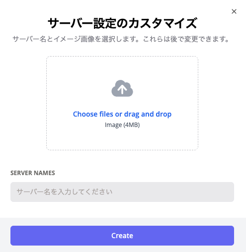
TODO: Image Upload としていた箇所の実装。
FileUpload コンポーネントを作成する。
- endpoint: “messageFile” | “serverImage” でアップロード先を指定する。
- value: 既存の画像URLを指定する?
- onChange: アップロード後のURLを受け取る?
"use client";

interface FileUploadProps {
  onChange: (url?: string) => void;
  value: string;
  endpoint: "messageFile" | "serverImage";
}

export const FileUpload = ({ onChange, value, endpoint }: FileUploadProps) => {
  return <div>File upload component</div>;
};
<Form {...form}>
  <form onSubmit={form.handleSubmit(onSubmit)} className="space-y-8">
    <div className="space-y-8 px-6">
      <div className="flex items-center justify-center text-center">
        <FormField
          control={form.control}
          name="imageUrl"
          render={({ field }) => (
            <FormItem>
              <FormControl>
                <FileUpload
                  endpoint="serverImage"
                  value={field.value}
                  onChange={field.onChange}
                />
              </FormControl>
            </FormItem>
          )}
        />
      </div>
      <FormField
        control={form.control}
        name="name"
        render={({ field }) => (
          <FormItem>
            <FormLabel className="uppercase text-xs font-bold text-zinc-500 dark:text-secondary/70">
              Server Names
            </FormLabel>
            <FormControl>
              <Input
                disabled={isLoading}
                className="bg-zinc-300/50 border-0 focus-visible:ring-0 text-black focus-visible:ring-offset-0"
                placeholder="サーバー名を入力してください"
                {...field}
              />
            </FormControl>
            <FormMessage />
          </FormItem>
        )}
      />
    </div>
    <DialogFooter className="bg-gray-100 px-6 py-4">
      <Button variant="primary" disabled={isLoading}>
        Create
      </Button>
    </DialogFooter>
  </form>
</Form>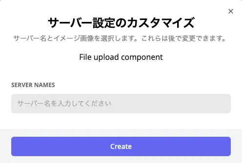
uploadthingのドロップゾーン設置
styles.cssを読み込むことでドロップゾーンにcssが適用される(ここはTailwindCSSでもカスタマイズできそうな記載がドキュメントにあった。
"use client";

import { UploadDropzone } from "@/lib/uploadthing";

import "@uploadthing/react/styles.css";

interface FileUploadProps {
  onChange: (url?: string) => void;
  value: string;
  endpoint: "messageFile" | "serverImage";
}

export const FileUpload = ({ onChange, value, endpoint }: FileUploadProps) => {
  return (
    <div>
      <UploadDropzone
        endpoint={endpoint}
        onClientUploadComplete={(file) => {
          onChange(file?.[0]?.url);
        }}
        onUploadError={(error: Error) => {
          console.error(error);
        }}
      />
    </div>
  );
};
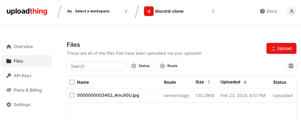
ファイルアップロードが成功することを確認
画像のプレビューを表示
アップロードした画像をプレビューする。importを追加。
"use client";

import Image from "next/image";

import { UploadDropzone } from "@/lib/uploadthing";

import "@uploadthing/react/styles.css";

interface FileUploadProps {
  onChange: (url?: string) => void;
  value: string;
  endpoint: "messageFile" | "serverImage";
}

export const FileUpload = ({ onChange, value, endpoint }: FileUploadProps) => {
  const fileType = value.split(".").pop();
  if (value && fileType !== "pdf") {
    return (
      <div className="relative h-20 w-20">
        <Image fill alt="Upload" className="rounded-full" src={value} />
      </div>
    );
  }

  return (
    <div>
      <UploadDropzone
        endpoint={endpoint}
        onClientUploadComplete={(file) => {
          onChange(file?.[0]?.url);
        }}
        onUploadError={(error: Error) => {
          console.error(error);
        }}
      />
    </div>
  );
};
URLのドメインを許可
この状態でアップロードファイルの画像を表示すると以下エラー
next/image, hostname “utfs.io” is not configured under images in yournext.config.jsSee more info: https://nextjs.org/docs/messages/next-image-unconfigured-host
ここでは utfs.io がアップロード先のドメインであるため、next.config.js に設定を追加する。
/** @type {import('next').NextConfig} */
const nextConfig = {
  images: {
    domains: ["utfs.io"],
  },
};

export default nextConfig;
これで画像が表示されるようになる。
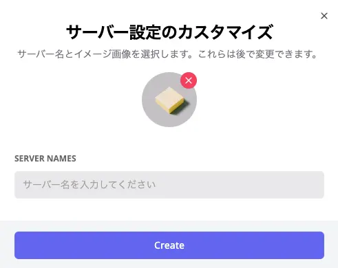
削除ボタンを追加
アップロードした画像をそのまま削除できるようにする。
Image をrelative内に配置し、削除ボタンが右上に表示されるようにする。
onChange に空で渡すことで画像を削除。
  if (value && fileType !== "pdf") {
    return (
      <div className="relative h-20 w-20">
        <Image fill alt="Upload" className="rounded-full" src={value} />
        <button
          onClick={() => onChange("")}
          className="bg-rose-500 text-white p-1 rounded-full absolute top-0 right-0 shadow-sm"
          type="button"
        >
          <X className="h-4 w-4" />
        </button>
      </div>
    );
  }